This is the introduction to Rainbow In The Dark, a series about games that actually contain colors. As always, you may click on images to view larger versions.
Longtime readers will know that I often lament the lack of colors in modern games. Whether it’s the constant reliance on only blue and orange, excessive use of shaders to tint the screen a monochrome hue in a crude attempt at atmosphere, or just dull greys and browns everywhere, games tend to have very limited colors these days. I’ve had the idea for a blog series celebrating colorful games kicking around in my head for a while, but two things in particular prompted me to start it now. First, my series about early console role-playing games (which has now expanded to include action/role-playing hybrids and Metroidvanias) has been emphasizing just how much more colorful these old games were, despite technical limits that meant they could only display a fraction of the colors that computers and consoles can today. And second, I have — at long last — started playing Dark Souls for the first time, and while it’s fascinating in many ways, it sure is very grey and brown. Since it will likely take me a long time to finish it, I want to counterbalance it with a bunch of colorful games.
So, I’m starting a new series, which will highlight and celebrate modern-ish games that dare to actually contain colors. It’s called Rainbow In The Dark. Read on for some more introductory thoughts.
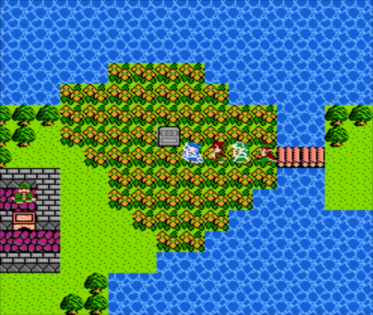
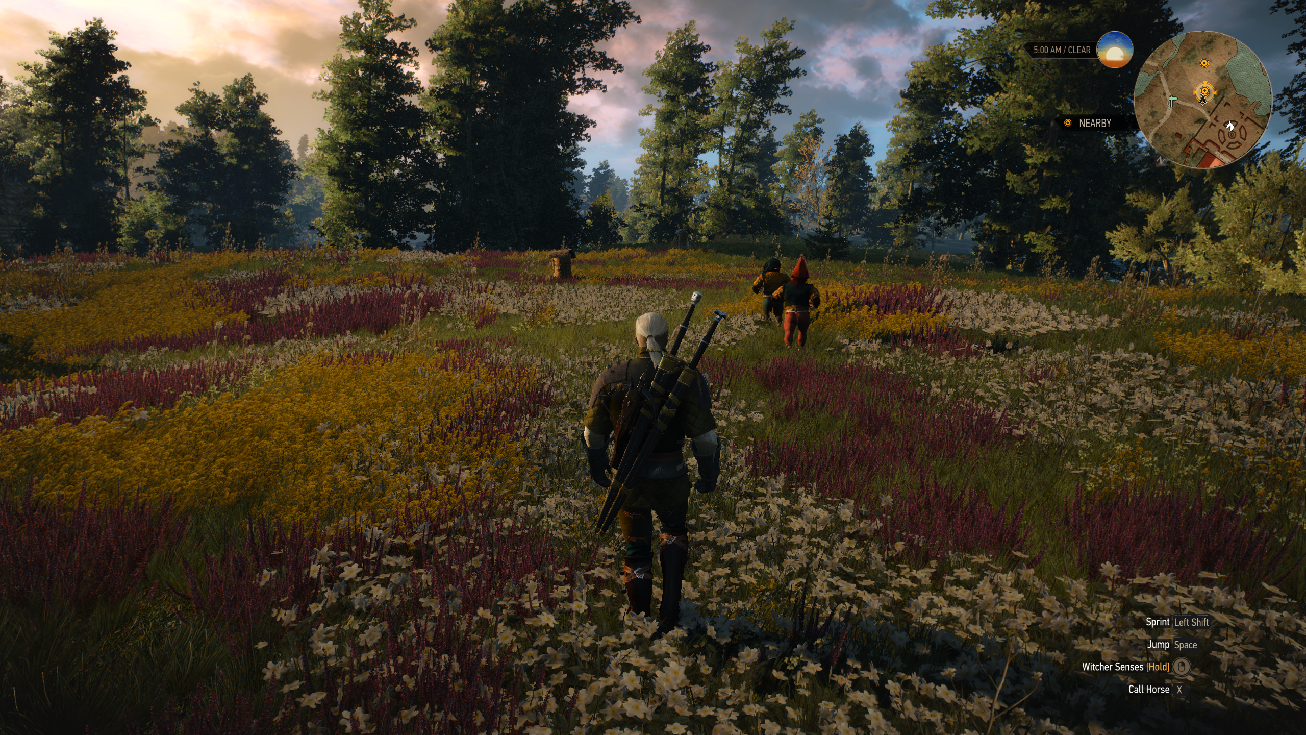
Top: Dragon Quest III, Japanese release 1988, US release 1992 (pictured). Bottom: The Witcher 3, 2015.
My trek through early console games hasn’t made it past the 1980s at the time of writing (going by original Japanese release dates), so the consoles I’m emulating were still pretty limited. The Famicom/NES, for example, could display up to 25 colors simultaneously, out of 54 total colors. Its competitors raised the bar a little: Sega’s Master System could display 32 colors simultaneously, out of a total of 64, while the PC Engine by Hudson Soft and NEC (known as the Turbografx-16 in the US) had an impressive 16-bit graphics system that let it display a whopping 482 colors simultaneously, out of a total of 512. Today, most monitors and TVs can display a minimum of 16.8 million colors (that’s 256 levels each for red, green and blue) and some up the color depth to push the total number into the billions.
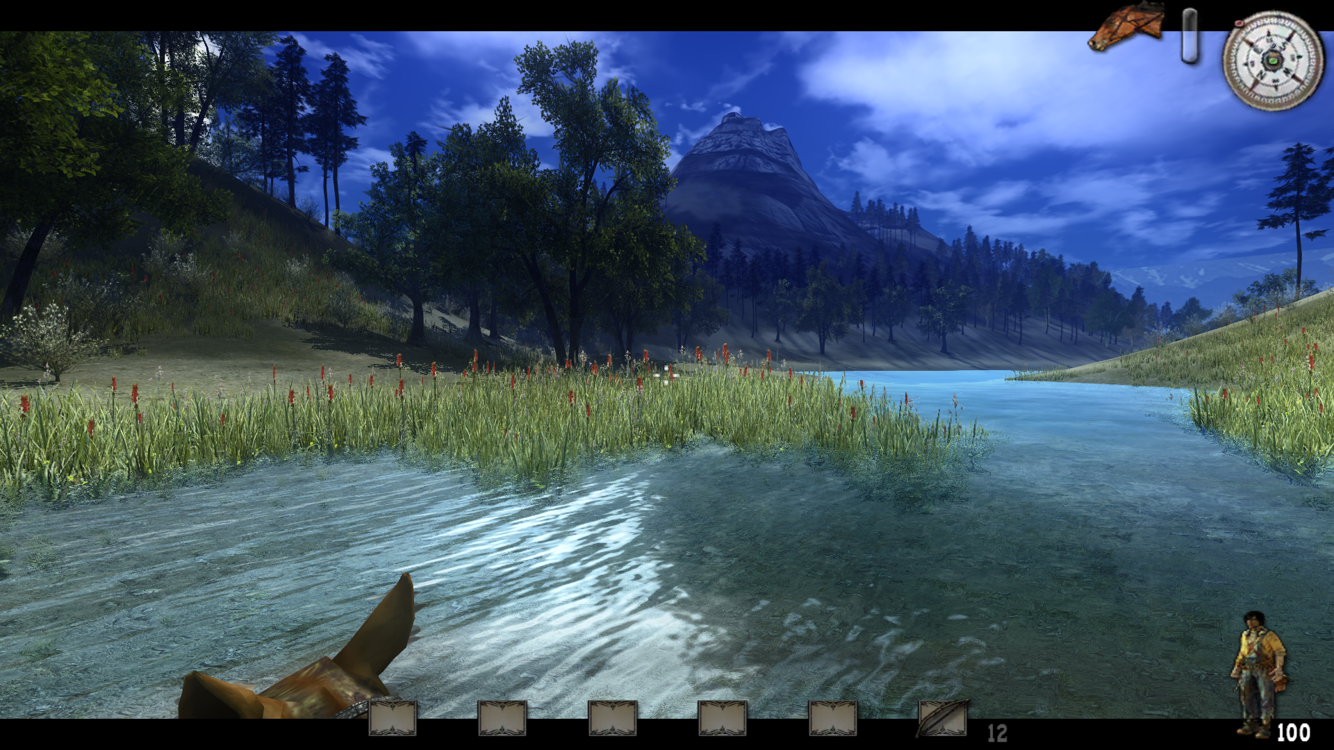
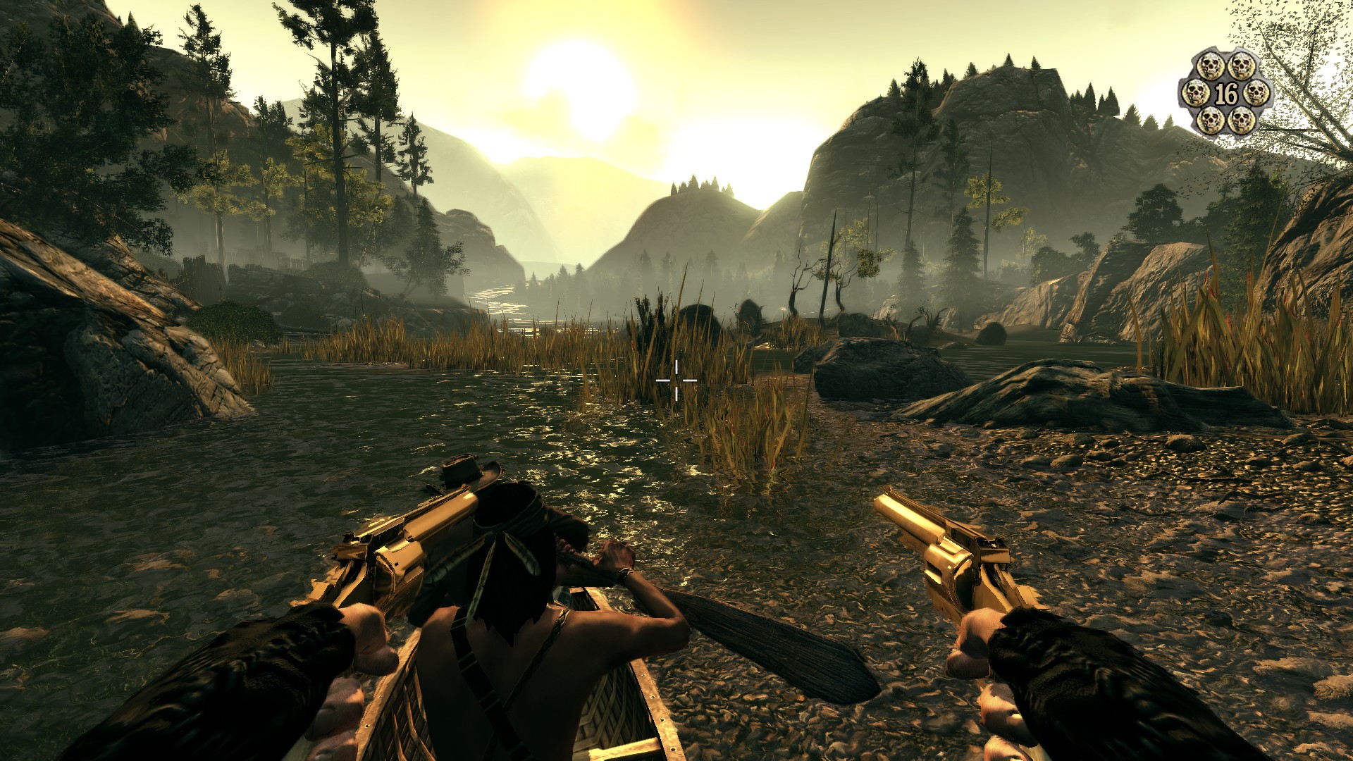
Top: Call of Juarez, 2006. Bottom: Call of Juarez: Bound in Blood, 2009.
So it should follow that modern games would be more colorful than their ancestors, yet the opposite is often the case. Although it does make some sense: when you only have 25 colors to work with for a given scene, you will pick those 25 very carefully. And as each new technological leap added more colors, developers could revel in them with vibrant artwork. Art direction for modern games is perhaps a more challenging task, with far more detailed images, models, and environments to paint with a vast array of colors. How to evoke the right feeling of dread — or triumph, or peace — that a particular scene needs, when the options are nearly limitless? There’s also just way more art in games now, often requiring huge development teams many times larger than the small groups who made games in the 1980s. With so much to do, I can see why someone might decide to stick to a few dominant colors in most scenes, or to simply add a green tint to the screen when players enter a swampy area. A quick way to induce gloom.
![]()
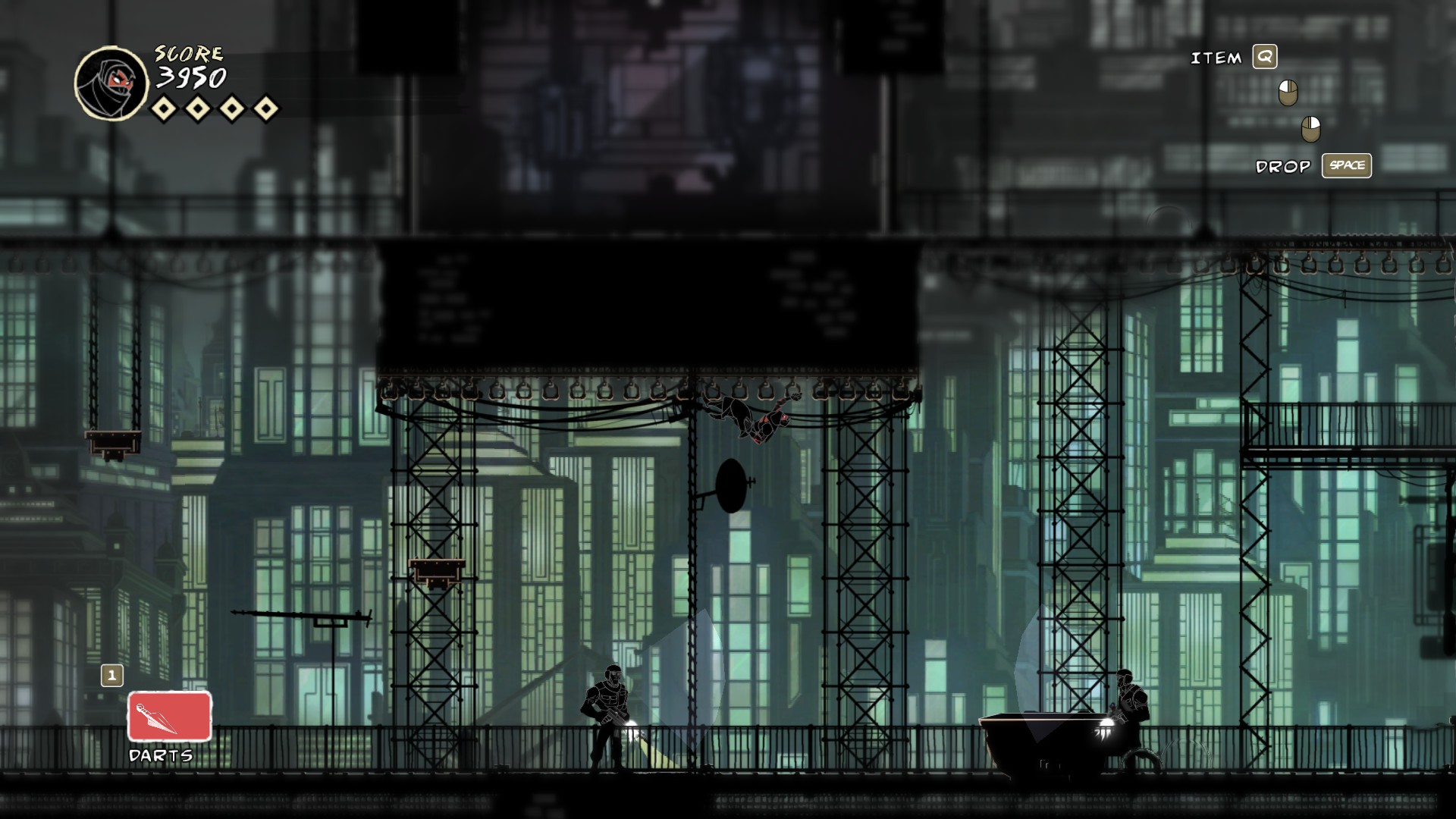
Top: Iconoclasts, 2018. Bottom: Mark of the Ninja, 2012.
Yet there are some recent games that experiment with wider palettes. I’m always happy to find these, because they stand out against a sea of muted, near-monochrome games. Don’t get me wrong, I love a lot of games that barely contain any colors, but I like to offset them once in a while with something a little brighter. Rainbow In The Dark will celebrate such games, and also encourage me to specifically seek them out. I’ve already played a few games that I want to highlight as part of the series, but I have a longer list of games I’d like to play specifically because of how colorful they are. As the series continues, I expect that most Rainbow In The Dark posts will be about games I specifically picked for it, hopefully adding some color to my general gaming routine in the process. We’ll see if that actually works out; my Keeping Score series was originally conceived as an excuse to specifically pick out games from my backlog that also included their soundtracks, but more recently has just highlighted games whose exceptional musical scores I only discovered after playing them. Only time will tell if Rainbow In The Dark will fall into a similar pattern, but I hope not. Colors should be easier to judge than music at first glance.
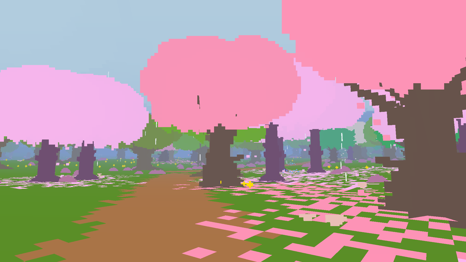
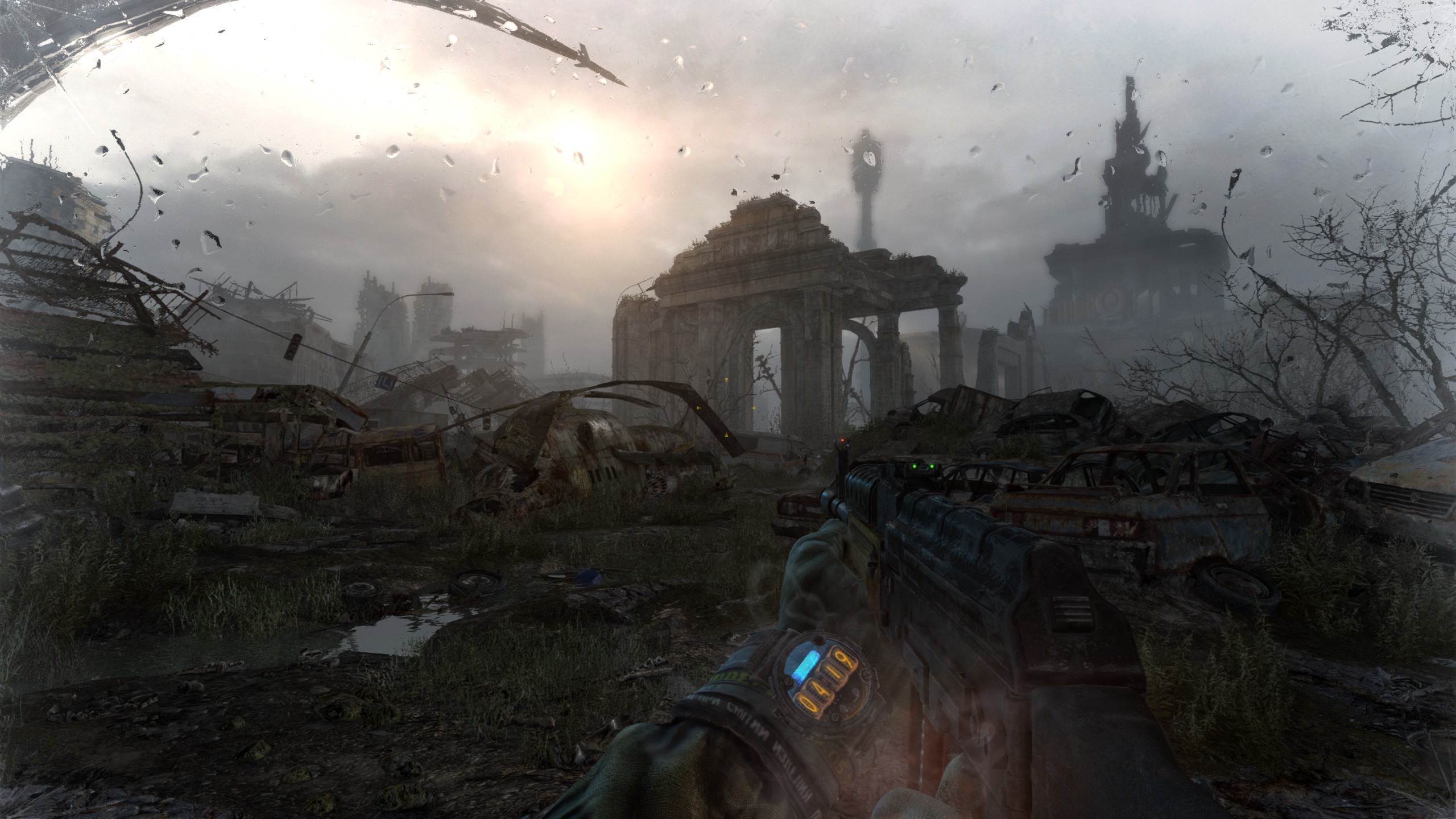
Top: Proteus, 2013. Bottom: Metro: Last Light, 2013.
Stay tuned for the first proper Rainbow In The Dark post to go up soon! After that, they’ll be appearing periodically. I hope they will help bring a little light to your gaming life.


thekelvingreen
I look forward to this series! Modern games tend to try to be too serious, which usually means everything is grey. That’s okay sometimes, but let’s celebrate colour!
Gregg B
(I wrote a good chunk of this yesterday so nice to see DRG being the first entry!)
This is an(other) interesting topic for a series Walter!
Funnily enough, the two games I’m playing at the moment, Immortals Fenyx Rising (my first Ubisoft open world game) and Friends vs Friends (a new 1v1 or 2v2 card based FPS) are both very colourful! Even Deep Rock Galactic, which I’ve been playing for a while now, despite being a dark subterranean game, manages to inject lots of colour thanks to its interesting biomes, bio-luminescent flora and fauna and a terrific lighting model.
While I certainly think there are lots of muted/monotone games out there, many of which are shooting for verisimilitude, looking at some of the most popular games over the last few years like Fornite, most of Nintendo’s output (particularly Splatoon which is all about colour), Horizon Forbidden West (realistic, but you can see how they’ve tried to stay bright and colourful), Psychonauts 2, Ratchet & Clank, plenty of indie oddballs like Fall Guys, Among Us, Hades, Going Under, Atomicrops etc. I feel like there’s still loads of colour to be found out there, thankfully! The new Marathon reveal was amazing in its use of uncharacteristically bright colours in the AAA online shooter space.
I love how bright that night time Call of Juarez pic is; it reminds me of Fenyx’s night times where the land seems to be blue lit by the moon and stars.
Also, great to see the beautiful Proteus. An all-time favourite.
Waltorious
Glad to see enthusiasm for this series! And yeah, it was funny to hear you mention Deep Rock Galactic when I’d just posted it as the first proper entry in the series.
I appreciate your pointers towards colorful games. I’ve already written about Psychonauts 2 so I won’t be revisiting that for this series, but I might consider the others. It’s interesting to see you highlight Horizon: Forbidden West for being colorful, because while what I’ve seen of its predecessor Horizon: Zero Dawn (I still haven’t played it, but it’s on my list!) is beautiful, I would not consider it colorful. It seems to give everything a reddish-brown tint, in a way that reminds me of the comparison between the first two Call of Juarez games that I showed in this post (by the way, the image of the original game isn’t supposed to be a night scene, I don’t think… although the sky is darker than one would expect). It’s good to hear that Forbidden West goes for a more varied palette. I guess it’s kind of an inversion of what happened with Call of Juarez; there the sequel turned everything brown, here the sequel is getting rid of the brown and bringing in more colors.
Speaking of Proteus, I’m inordinately proud of that comparison with Metro: Last Light. Two first-person games from the same year, both of which I enjoyed, but with vastly different approaches to color.
Gregg B
Oh wow, it’s not meant to be night time?!
I’ve not played Horizon Forbidden West but, yeah, I recall thinking the original looked a lot more monotone/brown compared to the sequel! From screenshots, clips and gameplay trailers, it looks like they went for an almost Avatar-esque Pandoran tropical world with Forbidden West. Perhaps you’re right but it definitely seems to be on the more colourful end of the realistic AAA spectrum!
Metro: Last Light is one I need to check out. I played Metro 2033 Redux years ago and had mixed feelings about the end segments and ending but I’d like to return to the series.
I forgot to mention Hi-Fi Rush! I’ve yet to try it, but the visual style and colours really stand out.
Looking forward to reading the DRG entry!
Waltorious
I wrote about Metro: Last Light if you want more information. I liked it but it does have some problems.
thekelvingreen
Horizon Zero Dawn is a bit reddish-brown in places, but that’s more to do with the setting than anything; large chunks of the game are set in a desert/badland area. But there are other areas too, including snowy mountains and more lush forest, it’s just the main plotline tends to stick to the brown bits.
Waltorious
Good to hear there’s some environment variety. Since I haven’t played it yet, I’ve been basing my judgments off of image searches for screenshots, which seem to have a red-brown cast even for scenes where I’d expect more color like jungles and forests. I’m still excited to play it though, so I guess I’ll see for myself… eventually.